From plant data to decisions, with statistical control built in

PIPER View connects directly to your historian and delivers 27+ controls — from trend charts to SPC control charts and particle size curves — ready to operate, with a learning curve of just minutes.

Pillars

1. Statistical process control built in

I-MR, box plot, Pareto, process correlation, and particle size curves, no third-party plugins.

2. Deploys where you work

Cloud or on-premise, connected to PI System, PIPER Modeler/Historian, or ODBC.

3. Intuitive, minutes-long learning curve

Most users operate dashboards the same day, with no lengthy training curve.

Core Controls

The foundation of every dashboard: charts, tables, indicators, and events, ready to drag and drop.

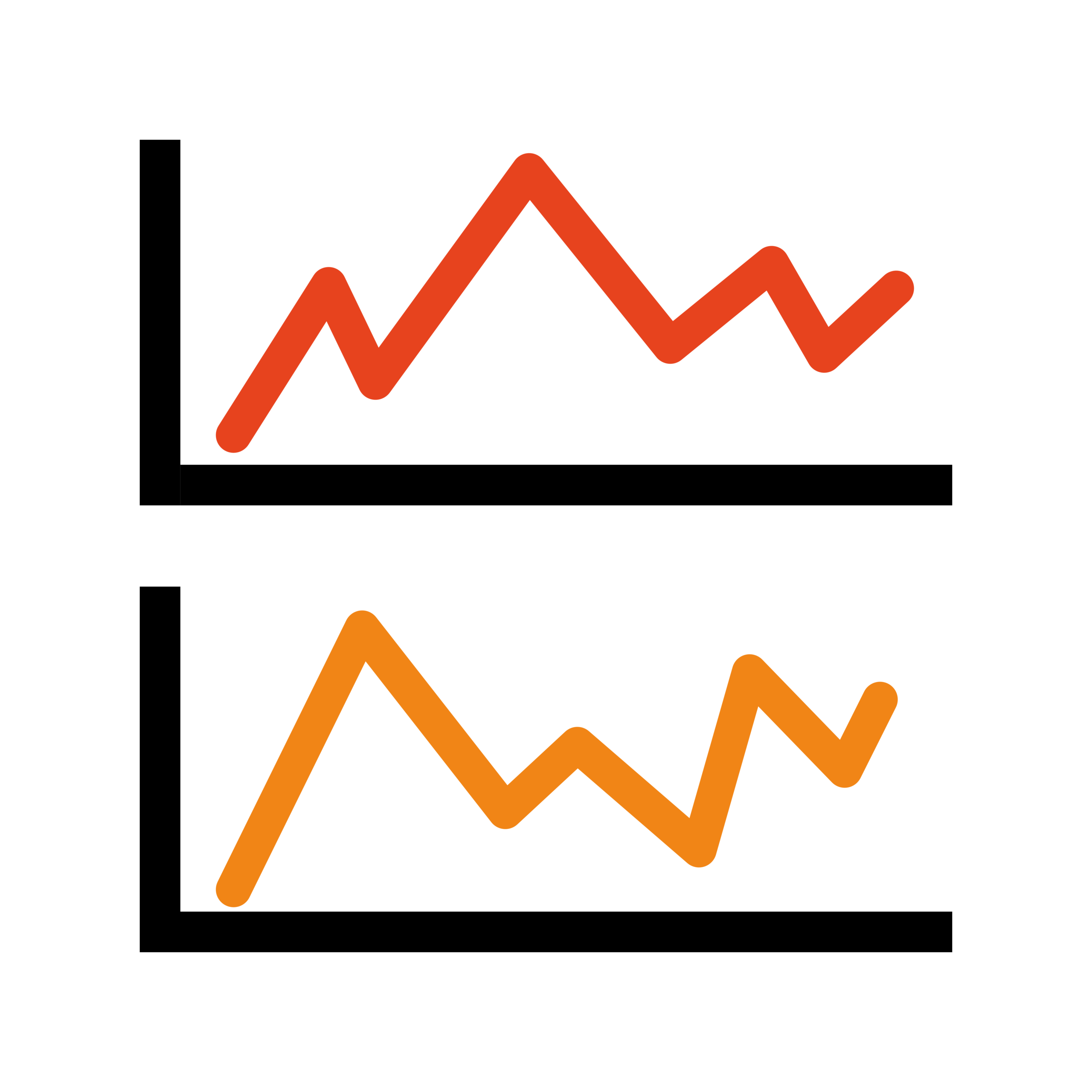
Trend

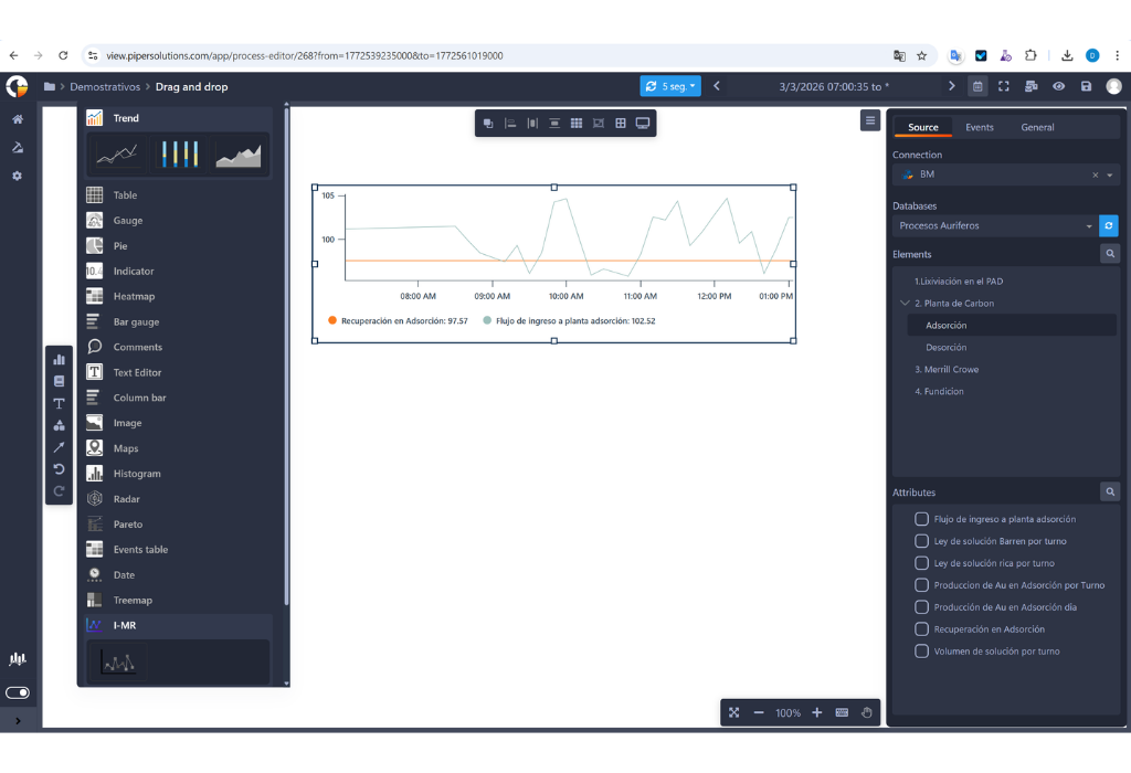
Plots data points across successive time intervals. Example: comparing a SAG pump's suction and discharge pressure during a shift. Why it matters: catches cavitation before a failure, without waiting for a maintenance report.
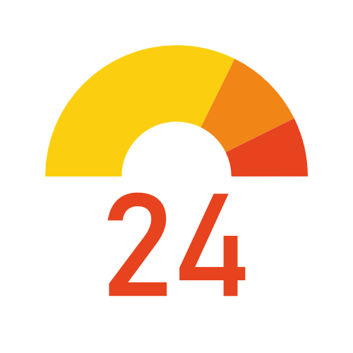
Gauge

Current value against limits, speedometer format. Example: a boiler's pressure against its safe range. Why it matters: instant read on the available safety margin.

Table

Tabular data with cell-level calculations, similar to Excel. Example: a daily shift production report with tonnage and ore grade. Why it matters: the operator doesn't build the report by hand — the calculations are already there.
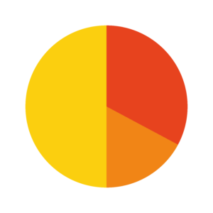
Pie

Percentages and proportions by segment. Example: energy consumption breakdown by plant area. Why it matters: prioritizes where to focus an energy-efficiency project.
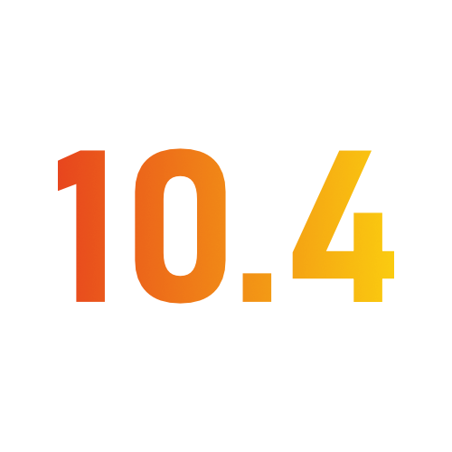
Single value

A highlighted numeric value, with dynamic color based on limits. Example: a tailings tank level, turning red past the safety limit. Why it matters: immediate visual alert with no number interpretation needed.

Heatmap

Data represented by color between a min and max. Example: a SAG mill's bearing temperatures throughout the day. Why it matters: catches hot spots before a costly mechanical failure.

Bar gauge

Same as the gauge, in bar format. Example: ore silo fill levels. Why it matters: ideal when comparing many similar assets side by side.

Comments

Text log entries over a time period. Example: a shift logbook with operator observations alongside the data. Why it matters: connects the human "why" to the numeric data.

Text Editor

Rich text (headings, lists, formatting) to document or add context. Example: scheduled maintenance notes or shift instructions alongside process data. Why it matters: the dashboard communicates, not just displays numbers.

Column bar

Vertical bars to compare values across categories. Example: monthly production across 3 concentrator plants. Why it matters: spot at a glance which plant is falling short of target.

Image

Displays a static image on the dashboard. Example: the plant logo, a photo of specific equipment, or a process flow diagram (PFD) as visual reference. Why it matters: gives immediate visual context with no need for an external document.

Maps

Geographic markers, filterable by metadata. Example: oil well locations with daily production as a filter. Why it matters: geographic context for operations spread across multiple sites.

Radar

Comparison of 3+ quantitative variables in one chart. Example: 4 shifts' performance across 5 KPIs at once. Why it matters: compares overall performance, not just one isolated KPI.

Events table

Process event table with duration and cause. Example: a mill's unplanned stoppages, sorted by duration. Why it matters: prioritizes maintenance by real impact, not perception.

Date

Date control — displays or lets users select dates within the dashboard. Example: filtering a production report by a specific date range without leaving the panel. Why it matters: gives granular date control without relying only on the dashboard's general time picker.

Treemap

Hierarchical data in nested rectangles, sized by value. Example: energy consumption by plant area and sub-area. Why it matters: shows where the real spend is, not just the total.

Events gantt

Gantt view of events to compare duration and overlap. Example: checking if two scheduled maintenance windows overlap. Why it matters: prevents scheduling conflicts before they happen.

Trend data table

Combines a trend chart and table in one control. Example: a motor's temperature curve alongside its exact hourly values. Why it matters: visual context and exact value in one panel, no switching screens.

Register Data

A control for manually registering data within the dashboard, without leaving PIPER View. Example: an operator enters a lab sample result (e.g. ore grade) directly in the same panel where they view historian data. Why it matters: combines manual and automatic process data in one place, with no separate spreadsheet needed.
Statistical Process Control (SPC)

Process quality and stability, with the statistical rigor your operation demands.

I-MR

Individual (mean) and Moving Range (variation between readings) control charts, the SPC quality standard. Example: monitoring copper grade in the final concentrate. Why it matters: catches a process shift before it produces an out-of-spec batch.
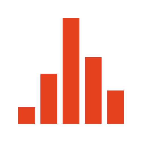
Histograma

Frequency distribution of your process data. Example: concentrate moisture over the last 30 days. Why it matters: confirms the process stays within target, not just on average.
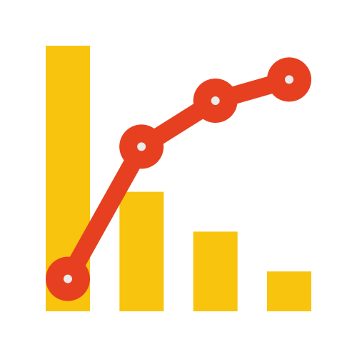
Pareto

Bars and a cumulative line to find the highest-impact causes (80/20 rule). Example: which 3 causes explain 80% of a crusher's downtime. Why it matters: focuses improvement effort where it actually pays off.

Box plot

Distribution, spread, skew, and outliers across multiple variables, with a tooltip breakdown. Example: comparing ore grade variability across 6 extraction faces. Why it matters: catches abnormal variability that an average hides.

Process Correlation

Cause-effect relationship between two variables with SPC limits (LSL/USL/UCL) and automatic color coding. Example: how flotation air flow affects froth percentage. Why it matters: finds the real control lever, not just an apparent correlation.
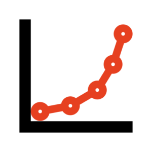
Granulometric Curve

Particle size distribution, with Gates-Gaudin-Schuhmann and Rosin-Rammler models. Example: checking if a grinding circuit's P80 meets the metallurgical target. Why it matters: direct control of a critical metallurgical KPI, no exporting to separate software.

Beeswarm

Shows each individual data point spread out to avoid overlap, revealing the real shape of the distribution and clustering without losing individual values (unlike a histogram, which bins into bars). Example: viewing every ore grade sample from an extraction face for the week, spotting a cluster of anomalous samples instead of just an average. Why it matters: exposes real point-by-point variability — an average or histogram can hide a cluster of problem values.

Scatter

XY scatter to relate two numeric variables. Example: feed ore grade vs. metallurgical recovery. Why it matters: reveals relationships a table of numbers would never show.
Features and upgrades

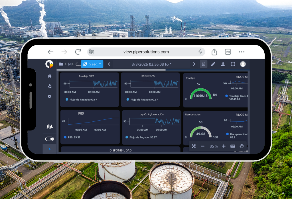
The true power of PIPER View lies in its ability to create high-impact operational dashboards with unprecedented ease. Our platform is distinguished by:

  • Real-time visualization with intuitive temporal navigation between different periods (day, month, year, fortnight)
  • Advanced customization tools to create dashboards that perfectly fit your specific needs
  • Versatile interface that allows the integration of multiple visual elements such as graphs, tables, and figures, faithfully recreating the operation of the industrial process for more intuitive and effective interpretation
  • Flexibility in data export, allowing complete dashboards to be converted to PDF format for executive reports and to Excel for detailed analysis
  • Advanced automation system that includes scheduled report delivery via email, keeping teams informed without manual intervention.
Platform and Administration

What your IT team needs to know before the user reports the problem.

Platform health panel

Connection status, network latency (P95), and load-time distribution. Example: IT spots a downed connection before operators report a blank dashboard.

Top 10 slowest dashboards

Spot which dashboards need optimization. Example: discovering a dashboard takes 12 seconds to load and prioritizing it.

Technical error log

API failure diagnostics with timestamp and trace. Example: diagnosing why an endpoint keeps failing.

Usage analytics

Access breakdown by device, browser, and OS. Example: discovering 40% of access is from mobile.

Navigation and Time

Built for how a control room actually works: by shift, live, 24/7.

Flexible time picker

Free, Monthly, Shift-based, or Daily. Example: a supervisor reviews last Thursday’s night shift in two clicks.

Real-time sync

 One click on “Auto” and the dashboard updates itself. Example: the control room sees variables update live.

Dark mode and fullscreen

Built for 24/7 control rooms. Example: a control room monitor displays it fullscreen and dark around the clock.

Export and Automation

Reports that show up on their own, in the right inbox, in the right format.

Multi-format export

PDF, Excel, or image for report-type dashboards; PDF (paginated) and image for process-type. Example: generating the shift-close report as a signature-ready PDF.

Automated email delivery

Schedule delivery by frequency and time. Example: the plant manager receives the daily report at 6am without asking.

ADVANTAGES

Why Choose PIPER View?

Real-Time Operational Visualization

Visualize production, assets, and industrial processes in real time through interactive dashboards.

Contextualized Dashboards

Relate KPIs, events, and operations through contextualized visualization.

Production Intelligence

Monitor production, performance, and operational continuity from a single operational view.

Industrial Trends and KPIs

Analyze trends, variables, and industrial KPIs to accelerate operational decisions.

Multi-Site Visualization

Monitor operations, plants, and processes through centralized dashboards.

Executive Dashboards

Visualize operational and production indicators for operational and corporate teams.

Modern Visual Experience

Modern industrial dashboards designed for real-time critical operations.

Real-Time Web Access

Access industrial dashboards from any device through modern web technology.

Features

Monitor real-time indicators with PIPER View controls.

Real Time Operational visibility

It allows you to create interactive Dashboards and see all your data in one place. In addition, you can quickly share information and keep members of the organization informed at all times.

Alignment if Charts and Connecting Elements

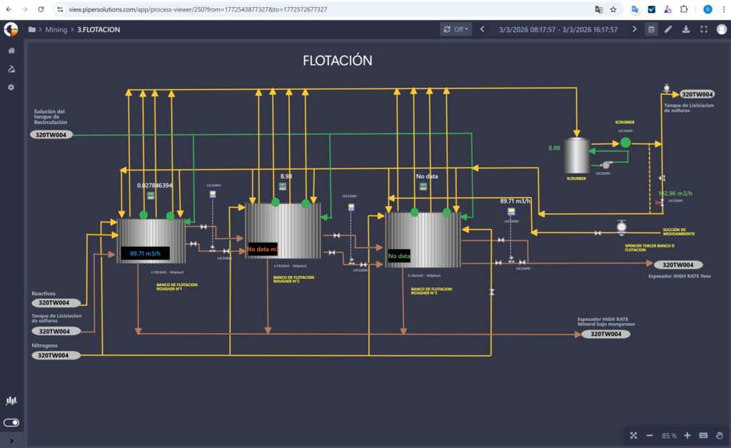
To have more organized dashboards on your workspace within PIPER View, you can align them to the left, right, horizontally, vertically, top, or bottom. Another new functionality is the graphic elements that help you visually indicate the flow of your work or the connection between two dashboards.

Pantalla de Procesos

Custom Tags and Color Shading for Processes 

Process charts can be linked to information tags to be more in harmony with the dashboard. Additionally, the fill colors and shading are customizable, to the point that a palette can be applied according to the information ranges used in the tags mentioned above.

Collaboration

The option to share a workspace panel in single-view mode with a specific list of users or groups. This allows sharing viewing access with other users within the organization. Additionally, it can be sent by email, exported to PDF, or Excel. It also allows the user to change the time range of a report and the type of chart displayed with real-time information.

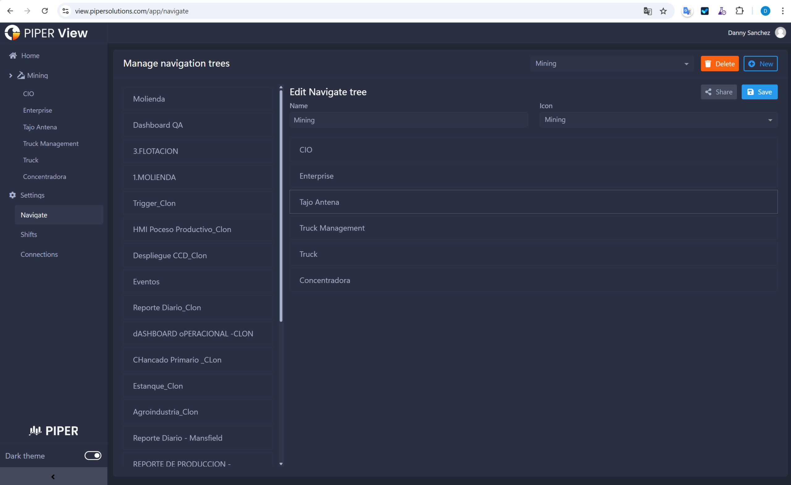
Navigation Tree

You can now configure Dashboards, folders, and access in the main menu. Additionally, it provides the ability to manage who can view your reports with our new available options.

Time Configuration

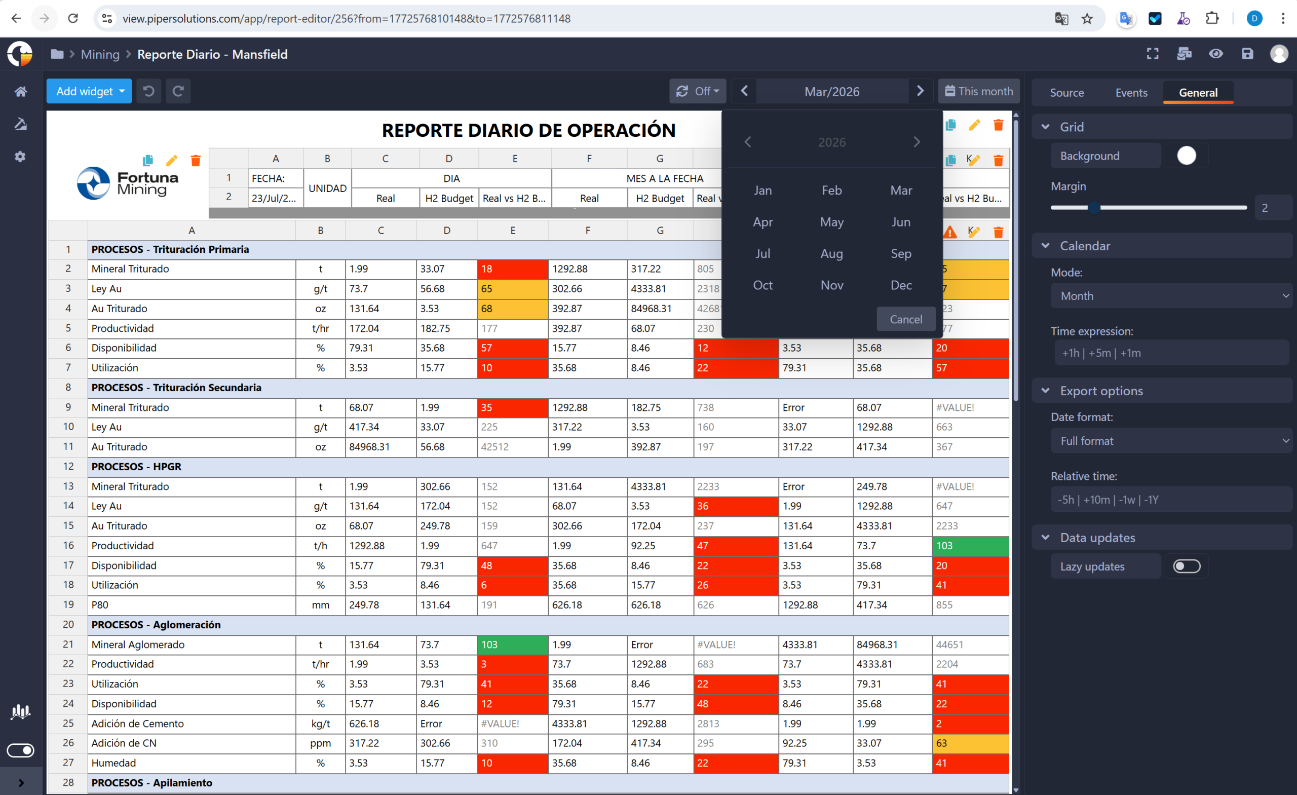
You can now customize the date filter. Previously, it was only the start and end in the calendar. But now, in the editing part, there is a free-form calendar configuration, by shift (shift of people working in that time range), and daily. You have the ease of setting the default value when logging back in, designating the time in minutes or hours that can be done. You can also set the time zone regardless of the country you are in.

Dashboards

Monitor real-time indicators with PIPER View controls.

Projects

Mining

PIPER View 2026 Upgrade in Compañía Minera Antapaccay

Compañía Minera Antapaccay S.A. completed its upgrade to PIPER View 2026 using an isolated-environment methodology with parallel testing, ensuring a transition with zero critical downtime to its visualization and operational intelligence services. The project delivered new capabilities including a system observability panel, print-standard PDF dashboard export, responsive design, and a query inspector for data auditing — with full backward compatibility and zero rework on existing dashboards.

Espinar, Cusco, Perú

Mining

Implementation of PIPER Operational Intelligence Platform at Séguéla Gold Mine

Implementation of PIPER Operational Intelligence Platform at Fortuna Mining’s Séguéla Gold Mine to automate the collection, contextualization, and reporting of plant, laboratory, and mining data. The solution integrated multiple operational systems through custom APIs, automated daily production reporting, and provided real-time visibility into operational performance through centralized dashboards and analytics.

Solution Implemented

PIPER Operational Platform

  • PIPER Collector
  • PIPER Historian
  • PIPER Modeler
  • PIPER View
  • Operational APIs
  • Interface Monitoring & Notifications

Woroba, Costa de Marfil

Energy

Implementation of PIPER Operational Intelligence Platform at Puerto Bravo Thermal Power Plant

PIPER Solutions implemented the PIPER Operational Intelligence Platform at Samay S.A.C.’s Puerto Bravo Thermal Power Plant to centralize, historize, and contextualize operational data from the GE Mark VIe control system. The project included the integration of more than 4,000 process signals, the development of a standardized operational model, real-time operational dashboards, and Active Directory integration, providing a solid foundation for operational intelligence, process optimization, and future advanced analytics initiatives.

Arequipa, Perú

Mining

Implementation of PIPER View at Minera Antappacay

Cusco, Peru