PIPER VIEW
Create and share your operational dashboards quickly and easily. Boosting Real-Time Operational Intelligence. Industrial visualization that transforms data into decisions.
Live data. Fast decisions.
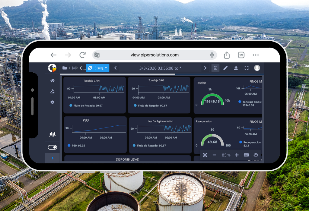
Enterprise View represents the new generation in operational data visualization, specifically designed for high-performance industries such as mining, hydrocarbons, and energy. This innovative web solution transforms the way organizations interact with their industrial data, offering a unique experience in real-time monitoring and analysis.
Unlike other solutions on the market, Enterprise View stands out for its connection versatility, allowing seamless integration with both PI System and Business Modeler, our powerful data historian. This flexibility ensures that your organization can fully leverage its existing investments in data infrastructure.
Features and upgrades
The true power of Enterprise View lies in its ability to create high-impact operational dashboards with unprecedented ease. Our platform is distinguished by:
- Real-time visualization with intuitive temporal navigation between different periods (day, month, year, fortnight)
- Advanced customization tools to create dashboards that perfectly fit your specific needs
- Versatile interface that allows the integration of multiple visual elements such as graphs, tables, and figures, faithfully recreating the operation of the industrial process for more intuitive and effective interpretation
- Flexibility in data export, allowing complete dashboards to be converted to PDF format for executive reports and to Excel for detailed analysis
- Advanced automation system that includes scheduled report delivery via email, keeping teams informed without manual intervention.
Features
Monitor real-time indicators with Enterprise View controls.
Real Time Operational visibility
It allows you to create interactive Dashboards and see all your data in one place. In addition, you can quickly share information and keep members of the organization informed at all times.
Alignment if Charts and Connecting Elements
To have more organized dashboards on your workspace within Enterprise View, you can align them to the left, right, horizontally, vertically, top, or bottom. Another new functionality is the graphic elements that help you visually indicate the flow of your work or the connection between two dashboards.
Custom Tags and Color Shading for Processes
Process charts can be linked to information tags to be more in harmony with the dashboard. Additionally, the fill colors and shading are customizable, to the point that a palette can be applied according to the information ranges used in the tags mentioned above.
Collaboration
The option to share a workspace panel in single-view mode with a specific list of users or groups. This allows sharing viewing access with other users within the organization. Additionally, it can be sent by email, exported to PDF, or Excel. It also allows the user to change the time range of a report and the type of chart displayed with real-time information.
Navigation Tree
You can now configure Dashboards, folders, and access in the main menu. Additionally, it provides the ability to manage who can view your reports with our new available options.
Time Configuration
You can now customize the date filter. Previously, it was only the start and end in the calendar. But now, in the editing part, there is a free-form calendar configuration, by shift (shift of people working in that time range), and daily. You have the ease of setting the default value when logging back in, designating the time in minutes or hours that can be done. You can also set the time zone regardless of the country you are in.
Features and Upgrades of Enterpise View
The infrastructure is designed to adapt to various operational scenarios, according to the specific requirements of each client, particularly in relation to inspection and supervision. In this case, one of our clients requested a solution for the online inspection and supervision of railway tracks. To address this, PIPER implemented Enterprise Forms as a tool for the structured recording of track conditions during inspections. Additionally, by using Enterprise View, the collected data can be visualized on interactive maps, allowing for the precise identification of critical points along the railway network.
All Controls
Monitor real-time indicators with Enterprise View controls.
Trend
Trend Line Control
Visualize the evolution of indicators over time.
Ideal for trend analysis, historical behavior, and forecasting.Bar Chart Control
Compare values across categories or segments.
Useful for comparative analysis, group distribution, and discrete metrics.Area Chart Control
Represent data accumulation or progression over time.
Perfect for visualizing proportions, cumulative values, and variable relationships.
Table
Configuration is much simpler now; you can select a group of cells, giving you the ability to change several at once. The copy and paste options now include text, design, and data source configuration. Additionally, the actions of undo and redo have been added within table changes.
Gauge
Trend Line Control
Visualize the evolution of indicators over time.
Ideal for trend analysis, historical behavior, and forecasting.Bar Chart Control
Compare values across categories or segments.
Useful for comparative analysis, group distribution, and discrete metrics.Area Chart Control
Represent data accumulation or progression over time.
Perfect for visualizing proportions, cumulative values, and variable relationships.
Indicator
Trend Line Control
Visualize the evolution of indicators over time.
Ideal for trend analysis, historical behavior, and forecasting.Bar Chart Control
Compare values across categories or segments.
Useful for comparative analysis, group distribution, and discrete metrics.Area Chart Control
Represent data accumulation or progression over time.
Perfect for visualizing proportions, cumulative values, and variable relationships.
Heatmap
A heat map is a graphical representation of data where individual values contained in a table are represented in different colors. A data point is defined by the intersection of the X and Y axes, and then the third value determines the color of the point. Enterprise View offers you this new dashboard to give you a different description of your KPI
Bar Gauge
The Bar Gauge control is a visual tool that combines the simplicity of a bar with the functionality of a gauge, ideal for displaying the current status of a metric in relation to a defined range (minimum, target, maximum).
Comments
Trend Line Control
Visualize the evolution of indicators over time.
Ideal for trend analysis, historical behavior, and forecasting.Bar Chart Control
Compare values across categories or segments.
Useful for comparative analysis, group distribution, and discrete metrics.Area Chart Control
Represent data accumulation or progression over time.
Perfect for visualizing proportions, cumulative values, and variable relationships.
Text Editor
Trend Line Control
Visualize the evolution of indicators over time.
Ideal for trend analysis, historical behavior, and forecasting.Bar Chart Control
Compare values across categories or segments.
Useful for comparative analysis, group distribution, and discrete metrics.Area Chart Control
Represent data accumulation or progression over time.
Perfect for visualizing proportions, cumulative values, and variable relationships.
Columm Bar
The Column Bar control (also known as a vertical bar chart) is used to compare values across different categories in a clear and straightforward way. It’s one of the most common controls in dashboards and analytical reports due to its simplicity and effectiveness.
Image
Trend Line Control
Visualize the evolution of indicators over time.
Ideal for trend analysis, historical behavior, and forecasting.Bar Chart Control
Compare values across categories or segments.
Useful for comparative analysis, group distribution, and discrete metrics.Area Chart Control
Represent data accumulation or progression over time.
Perfect for visualizing proportions, cumulative values, and variable relationships.
Maps
Geospatial Map
Visualization and navigation of asset positions on a geospatial map, allowing the correlation of information with real-time tags with various customization options, working with Google Maps API, among others.
Histogram
A histogram control is used to visualize the distribution of data within a given set, allowing the identification of patterns, variability, and potential anomalies. It is a key tool in statistical analysis, quality control, and process monitoring.
Radar
The radar control (also known as a spider chart or radar chart) is a visual tool that allows you to compare multiple variables in a single view, ideal for showing the relative performance of different indicators.
Pareto
The Pareto control is a visual tool based on the Pareto chart, which helps identify and prioritize the most significant factors in a dataset, following the 80/20 principle: 80% of the effects come from 20% of the causes.
Date
Trend Line Control
Visualize the evolution of indicators over time.
Ideal for trend analysis, historical behavior, and forecasting.Bar Chart Control
Compare values across categories or segments.
Useful for comparative analysis, group distribution, and discrete metrics.Area Chart Control
Represent data accumulation or progression over time.
Perfect for visualizing proportions, cumulative values, and variable relationships.
Treemap
The Treemap control is a hierarchical visualization tool used to represent structured data as nested rectangles. Each rectangle represents a category or subcategory, and its size and color indicate metrics such as volume, value, or impact.
I-MR
An IMR control chart (also known as I-MR or X-MR chart) is a type of statistical process control chart used to monitor processes where data are collected as individual measurements, rather than in subgroups. It’s especially useful when subgrouping is impractical due to low production volume, high cost, or long cycle times