ENTERPRISE VIEW
Crea y comparte tus paneles operativos de forma rápida y sencilla. Impulsando la inteligencia operativa en tiempo real. Visualización industrial que transforma datos en decisiones.
Datos vivos. Decisiones rápidas.
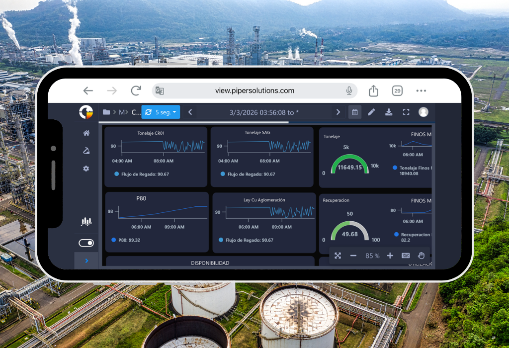
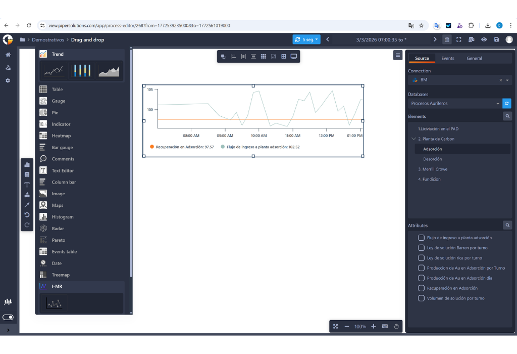
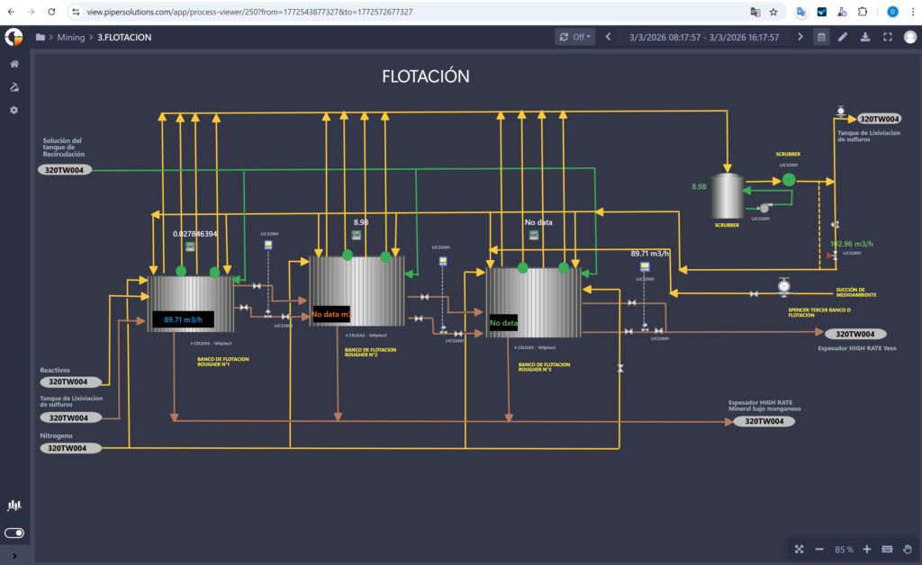
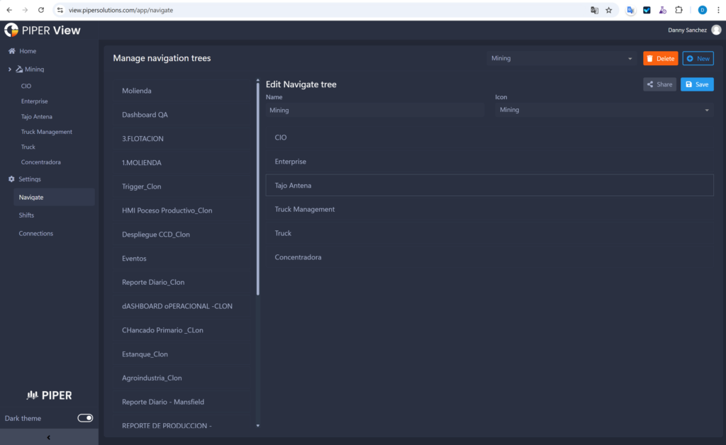
Enterprise View representa la nueva generación en visualización de datos operativos, diseñada específicamente para industrias de alto rendimiento como la minería, los hidrocarburos y la energía. Esta innovadora solución web transforma la manera en que las organizaciones interactúan con sus datos industriales, ofreciendo una experiencia única en monitoreo y análisis en tiempo real.
A diferencia de otras soluciones en el mercado, Enterprise View se destaca por su versatilidad de conexión, permitiendo una integración fluida tanto con PI System como con Business Modeler, nuestro potente historiador de datos. Esta flexibilidad garantiza que su organización pueda aprovechar al máximo sus inversiones existentes en infraestructura de datos.
Características y Actualizaciones
El verdadero poder de Enterprise View radica en su capacidad para crear paneles operativos de alto impacto con una facilidad sin precedentes. Nuestra plataforma se distingue por:
- Visualización en tiempo real con navegación temporal intuitiva entre diferentes periodos (día, mes, año, quincena)
- Herramientas avanzadas de personalización para crear paneles que se ajusten perfectamente a sus necesidades específicas
- Interfaz versátil que permite la integración de múltiples elementos visuales como gráficos, tablas y figuras, recreando fielmente la operación del proceso industrial para una interpretación más intuitiva y efectiva
- Flexibilidad en la exportación de datos, permitiendo convertir paneles completos a formato PDF para informes ejecutivos y a Excel para análisis detallados
- Sistema avanzado de automatización que incluye el envío programado de informes por correo electrónico, manteniendo a los equipos informados sin intervención manual.
All Controls
Monitor real-time indicators with Enterprise View controls.
Trend
Trend Line Control
Visualize the evolution of indicators over time.
Ideal for trend analysis, historical behavior, and forecasting.Bar Chart Control
Compare values across categories or segments.
Useful for comparative analysis, group distribution, and discrete metrics.Area Chart Control
Represent data accumulation or progression over time.
Perfect for visualizing proportions, cumulative values, and variable relationships.
Table
Configuración es mucho más sencilla, ahora puedes seleccionar un grupo de celdas, dando la posibilidad de cambiar varias a la vez. Las opciones de copiar y pegar ahora incluyen texto, diseño y la configuración de su fuente de datos. Además, ya se ha agregado las acciones de hacer y deshacer dentro de los cambios de la tabla.
Gauge
Trend Line Control
Visualize the evolution of indicators over time.
Ideal for trend analysis, historical behavior, and forecasting.Bar Chart Control
Compare values across categories or segments.
Useful for comparative analysis, group distribution, and discrete metrics.Area Chart Control
Represent data accumulation or progression over time.
Perfect for visualizing proportions, cumulative values, and variable relationships.
Indicator
Trend Line Control
Visualize the evolution of indicators over time.
Ideal for trend analysis, historical behavior, and forecasting.Bar Chart Control
Compare values across categories or segments.
Useful for comparative analysis, group distribution, and discrete metrics.Area Chart Control
Represent data accumulation or progression over time.
Perfect for visualizing proportions, cumulative values, and variable relationships.
Heatmap
Un mapa de calor es una representación gráfica de datos en la que los valores individuales contenidos en una tabla se representan en diferentes colores. Un punto de datos se define por la intersección de los ejes X e Y, y luego el tercer valor determina el color del punto. Enterprise View le ofrece este nuevo tablero para darle una descripción diferente de su KPI
Bar Gauge
The Bar Gauge control is a visual tool that combines the simplicity of a bar with the functionality of a gauge, ideal for displaying the current status of a metric in relation to a defined range (minimum, target, maximum).
Comments
Trend Line Control
Visualize the evolution of indicators over time.
Ideal for trend analysis, historical behavior, and forecasting.Bar Chart Control
Compare values across categories or segments.
Useful for comparative analysis, group distribution, and discrete metrics.Area Chart Control
Represent data accumulation or progression over time.
Perfect for visualizing proportions, cumulative values, and variable relationships.
Text Editor
Trend Line Control
Visualize the evolution of indicators over time.
Ideal for trend analysis, historical behavior, and forecasting.Bar Chart Control
Compare values across categories or segments.
Useful for comparative analysis, group distribution, and discrete metrics.Area Chart Control
Represent data accumulation or progression over time.
Perfect for visualizing proportions, cumulative values, and variable relationships.
Columm Bar
The Column Bar control (also known as a vertical bar chart) is used to compare values across different categories in a clear and straightforward way. It’s one of the most common controls in dashboards and analytical reports due to its simplicity and effectiveness.
Image
Trend Line Control
Visualize the evolution of indicators over time.
Ideal for trend analysis, historical behavior, and forecasting.Bar Chart Control
Compare values across categories or segments.
Useful for comparative analysis, group distribution, and discrete metrics.Area Chart Control
Represent data accumulation or progression over time.
Perfect for visualizing proportions, cumulative values, and variable relationships.
Maps
Mapa Geoespacial
Visualización y navegación de la posición de los activos en un mapa geoespacial, permite la correlación de información con tags en tiempo real con diferentes opciones de personalización, trabajando con Google Maps API, entre otros.
Histogram
A histogram control is used to visualize the distribution of data within a given set, allowing the identification of patterns, variability, and potential anomalies. It is a key tool in statistical analysis, quality control, and process monitoring.
Radar
The radar control (also known as a spider chart or radar chart) is a visual tool that allows you to compare multiple variables in a single view, ideal for showing the relative performance of different indicators.
Pareto
The Pareto control is a visual tool based on the Pareto chart, which helps identify and prioritize the most significant factors in a dataset, following the 80/20 principle: 80% of the effects come from 20% of the causes.
Date
Trend Line Control
Visualize the evolution of indicators over time.
Ideal for trend analysis, historical behavior, and forecasting.Bar Chart Control
Compare values across categories or segments.
Useful for comparative analysis, group distribution, and discrete metrics.Area Chart Control
Represent data accumulation or progression over time.
Perfect for visualizing proportions, cumulative values, and variable relationships.
Treemap
The Treemap control is a hierarchical visualization tool used to represent structured data as nested rectangles. Each rectangle represents a category or subcategory, and its size and color indicate metrics such as volume, value, or impact.
I-MR
An IMR control chart (also known as I-MR or X-MR chart) is a type of statistical process control chart used to monitor processes where data are collected as individual measurements, rather than in subgroups. It’s especially useful when subgrouping is impractical due to low production volume, high cost, or long cycle times
Características
Monitor real-time indicators with Enterprise View controls.
Reportes
Cuenta con reportes interactivos en tiempo real, construidos con información confiable desde AVEVA PI System o Business Modeler. Los operadores, supervisores y gerentes puedan tomar decisiones más oportunas.
Alineación de gráficos y Elementos
Para tener Dashboards más ordenados en tu mesa de trabajo dentro Enterprise View, puedes alinearlos a la izquierda, derecha, horizontal, vertical, arriba o abajo. Otra nueva funcionalidad son los elementos gráficos que te ayudarán a indicar visualmente cuál es el flujo de tu trabajo o qué conexión tienen dos Dashboards entre sí.
Etiquetas personalizadas y sombreado de color para procesos
Los gráficos de procesos pueden ser vinculados a Tags de información para estar en más armonía con el Dashboard. Además, los colores del relleno y su sombreado son personalizables, al punto que se puede aplicar una paleta de acuerdo a los rangos de información que se use en el Tag de líneas arriba.
Colaboración
La opción de compartir un panel de trabajo en el modo único de visualización con una determinada lista de usuario o una determinada lista de grupos. Para compartir el acceso de visualización a otros usuarios dentro de la organización. Todo esto además se puede enviar por correo, exportado a PDF o a Excel. Además, permite al usuario cambiar el rango de tiempo de un reporte, el tipo de gráfico que se muestra con información en tiempo real.
Compartir por Grupos
No es necesario compartir uno a uno, puedes colaborar entre grupos para cooperar entre ellos con los diseños de tus Dashboards. Con esta funcionalidad, puede acceder desde el navegador entre las secciones de la barra de tareas, lo que le brinda la posibilidad de compartir una lista de usuarios específica o una lista de grupos
Modo Oscuro
La principal ventaja es evitar la fatiga visual prescindiendo de colores muy fuertes para nuestros ojos, las personas que trabajan más tiempo frente a las pantallas desarrollan cierta sensibilidad por los colores claros y, en especial, el exceso de iluminación no trabaja con tranquilidad durante largas horas
Árbol de Navegación
Ahora puedes configurar los Dashboards, las carpetas y el acceso en el menú principal. Dando además la posibilidad de administrar quién puede ver sus informes con nuestras nuevas opciones disponibles.
Configuración de tiempo
Ahora puedes personalizar el filtro por fecha. Antes era solo el principio y el final en el calendario. Pero ahora en la parte de edición, hay una configuración de calendario de forma libre, por turno (turno de las personas trabajando en ese rango de tiempo) y de forma diaria. Uno tiene la facilidad de establecer el valor predeterminado cuando se vuelve a iniciar sesión, designando el tiempo en minutos u horas que se puede hacer. También configure la zona horaria sin importar en qué país se encuentre.
Opciones de Miniatura
Hemo aligerado la carga visual reduciendo las opciones a solo 3 botores, lo cual lo hace mucho más fácil de configurar los títulos, carpetas y etiquetas; manteniendo también las opciones principales de compartir y eliminar Dashboards. Además, hemos agregado un espacio entre la miniatura y las opciones donde ahora están disponibles nuestra opción de etiquetas. Porque en 'All Work Panels' puedes filtrar por etiquetas, una o varias a la vez.
Features and Upgrades of Enterpise View
1. Real-time Reporting and Data Management Features:
Reports:
The generation of real-time interactive reports from AVEVA PI System or Business Modeler allows industries such as mining, hydrocarbons, and electric power to access critical data for timely decision-making. These reports are also useful in water treatment to monitor water quality and in the food industry to manage production and the supply chain.
Collections:
The ability to generate identical dashboards from a pre-made model can be beneficial in all industries to standardize reports and simplify data analysis, such as in transportation fleet management or process tracking in the metalworking industry.
2. Group Collaboration and Time Filters:
Collaboration:
Allows you to share dashboards and collaborate between groups, which can be useful in all industries mentioned to improve communication and collaboration between teams in real time.
Group Collaboration:
It is not necessary to share one-on-one, you can collaborate between groups to cooperate with each other on your Dashboard designs. With this functionality, you can access from the browser between the sections of the taskbar, which gives you the possibility to share a specific user list or a group list.
Time Configuration:
Allows advanced customization of the date filter, which can be beneficial in the electric power industry to analyze energy demand at different times of the day and in the water treatment industry to monitor water quality over time.
3. Customization:
Chart Alignment and Connecting Elements:
This feature helps organize dashboards within Enterprise View, which can be useful in construction to monitor project progress, in transportation to manage the vehicle fleet, and in the metalworking industry to control manufacturing processes.
Custom Labeling and Color Fill for Processes:
The ability to link process charts to information tags and customize fill and shading colors is beneficial in big data management in sectors such as mining, hydrocarbons, and water treatment to analyze processes and improve operational efficiency.
4. User Interface:
Dark Mode:
This feature helps reduce eye strain, which can be beneficial for those who work long hours in front of screens in industries such as construction, transportation, and metalworking where constant monitoring is essential.
New Navigation Tree:
Makes it easier to configure and manage dashboards, which can be useful in all industries mentioned for better organization and access to critical information.
New Thumbnail Options:
Makes it easier to configure and manage dashboards, which can be useful in the food and beverage industry to monitor production and in the transportation industry to manage logistics.
Shapes
This section provides a comprehensive collection of figures and symbols that are essential for crafting detailed dashboards of systems and flows, effectively representing assets, processes, and equipment utilized across diverse industries. These visual elements not only enhance dashboard aesthetics but also facilitate a precise visual representation of infrastructure and operational processes. The versatility of this section lies in its ability to adapt to different contexts and specific needs of each industry, making it effortless to create highly informative and easy-to-understand dashboards for users. Examples include ASHRAE Controls and Equipment, ASHRAE Ducts, ASHRAE Pipes, Air Conditioning, Architectural, Arrows, Basic Shapes, Fans, Boilers, Buildings, Chemical, Computer Hardware, Computer Keys, Containers, Controllers, Conveyors (Belt, Miscellaneous, and Simple), Dust, Electrical, Finish, Flexible Tubing, Flow Meters, Food, General Manufacturing, HVAC, Heating, ISA Symbols (3-D), Industrial Miscellaneous, International Symbols, Laboratory, Logistics, Machining, Maps and Flags, Material Handling, Medical, Military, Mining, Miscellaneous Pipes, Miscellaneous Symbols 1 and 2, Mixers, Motors, Nature, Networks, Nuclear, Operator Interface, Panels, People, Pipes, Plant Facilities, Power, Process Heating, Pulp and Paper, Pumps, Renewable Energy, Safety, Scales, Segmented Pipes, Sensors, Tank Cutouts, Tanks, Valves, Vehicles, Water and Wastewater, and Wires and Cables. By incorporating these shapes and symbols, dashboards gain enhanced aesthetic appeal, facilitate an accurate visual representation of infrastructure and processes, improve user comprehension, and simplify the creation of informative dashboards.
La infraestructura está diseñada para adaptarse a diversos escenarios operacionales, de acuerdo con los requerimientos específicos de cada cliente, particularmente en lo relacionado con la inspección y supervisión. En este caso, uno de nuestros clientes solicitó una solución para la inspección y supervisión en línea de vías ferroviarias. Para ello, PIPER implementó Enterprise Forms como herramienta para el registro estructurado de las condiciones de las vías durante las inspecciones. Complementariamente, mediante el uso de Enterprise View, los datos recopilados pueden visualizarse en mapas interactivos, lo que permite ubicar con precisión los puntos críticos a lo largo de la red ferroviaria. Enterprise Forms as a tool for the structured recording of track conditions during inspections. Additionally, by using Enterprise View, the collected data can be visualized on interactive maps, allowing for the precise identification of critical points along the railway network.